
Frontend review
HTML
Heading elements
1 | <h1> Hello World </h1> |
Don’t have more than one h1 element.
Don’t jump between different levels , like don’t do h1 -> h3 directly, do h1 -> h2
Paragraph elements
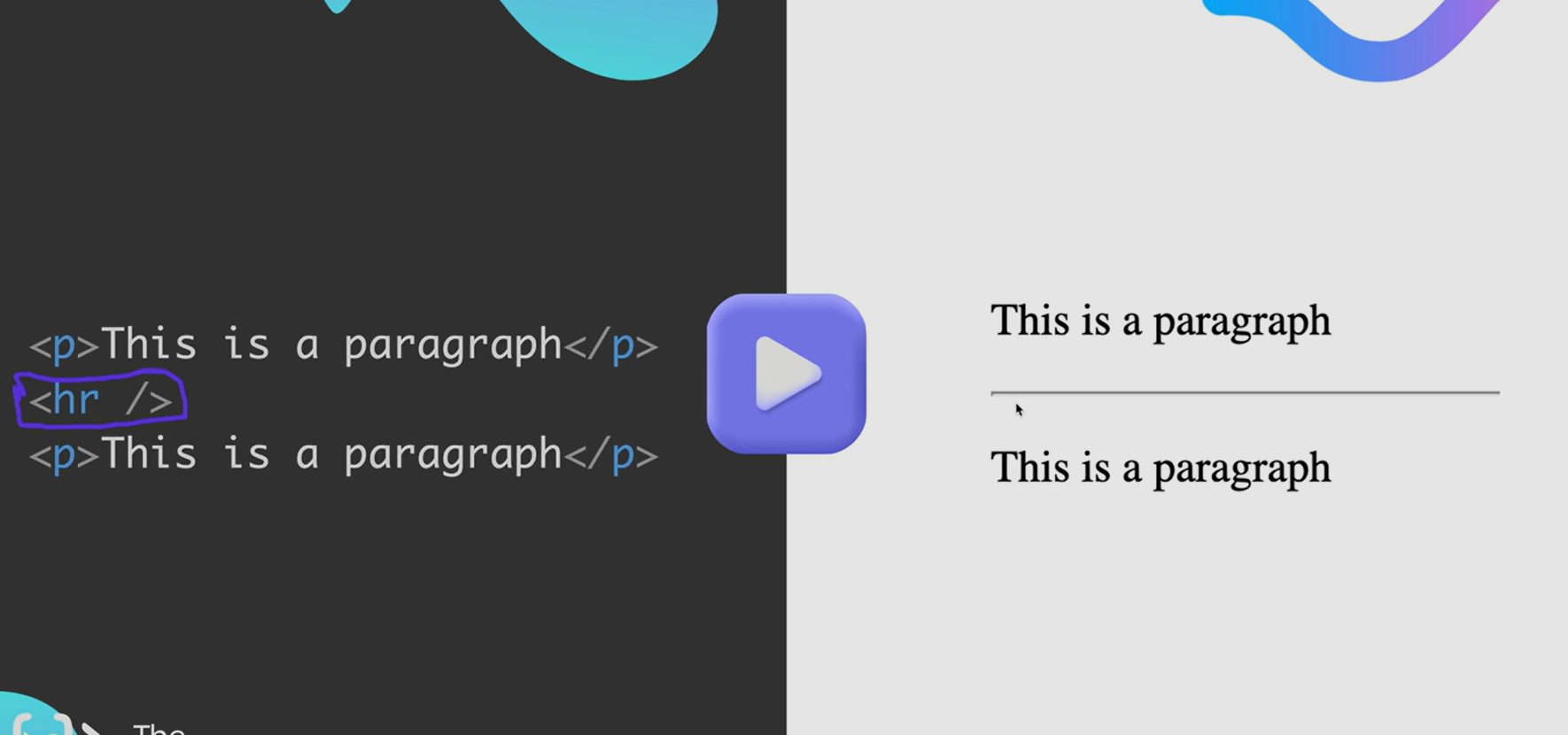
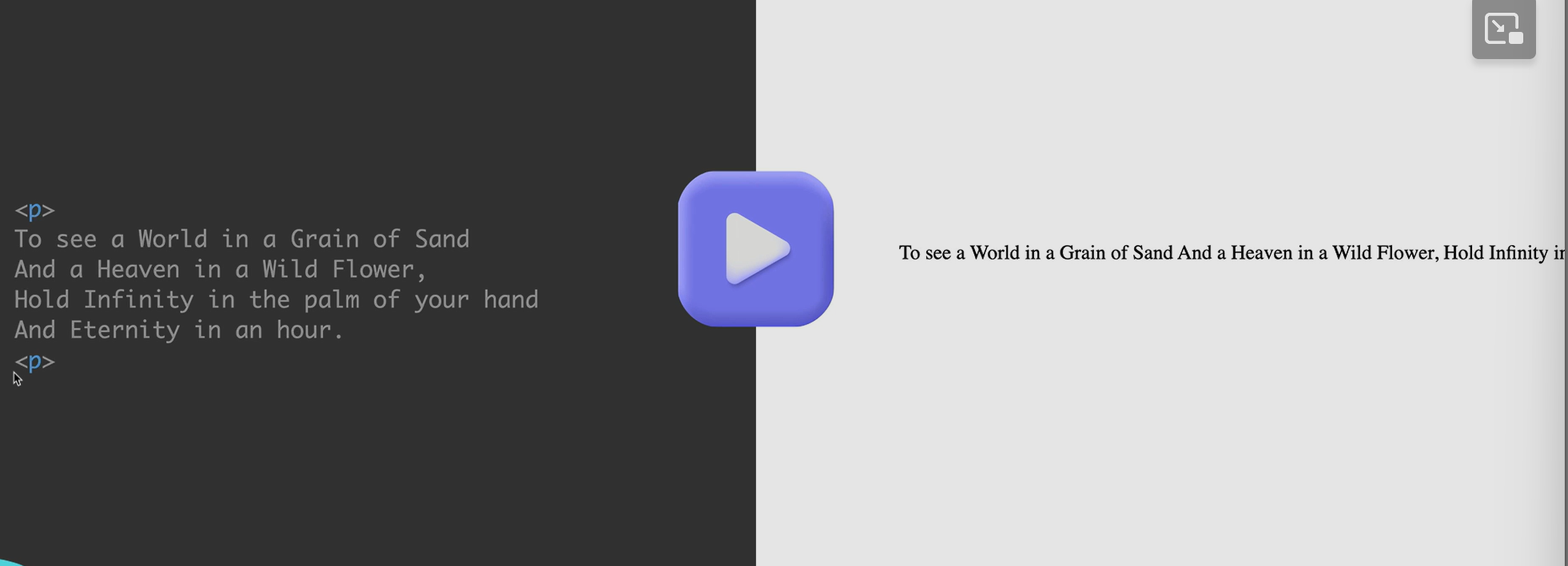
1 | <p>this is a paragraph</p> |
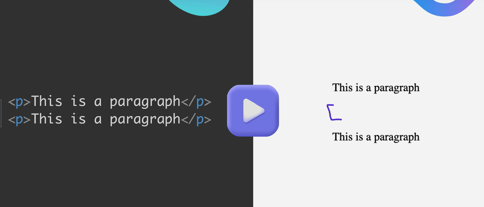
you can see them being separated with a line in between
Void elements
a void element is an element where you are forbidden from putting any content inside the tag.
1 | <p>this is a paragraph</p> |
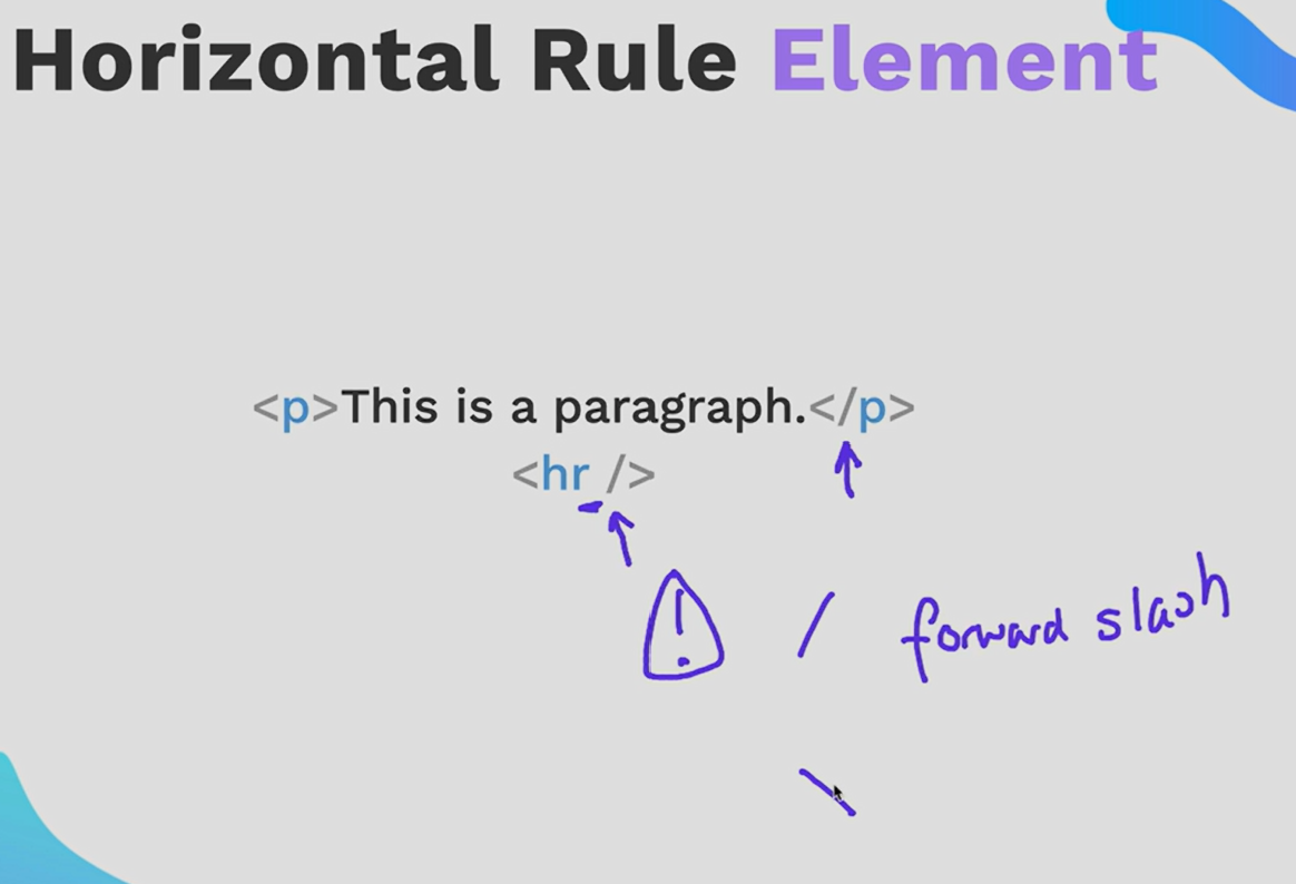
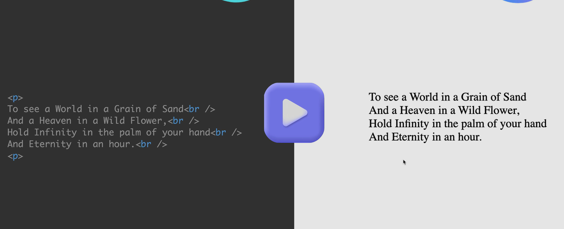
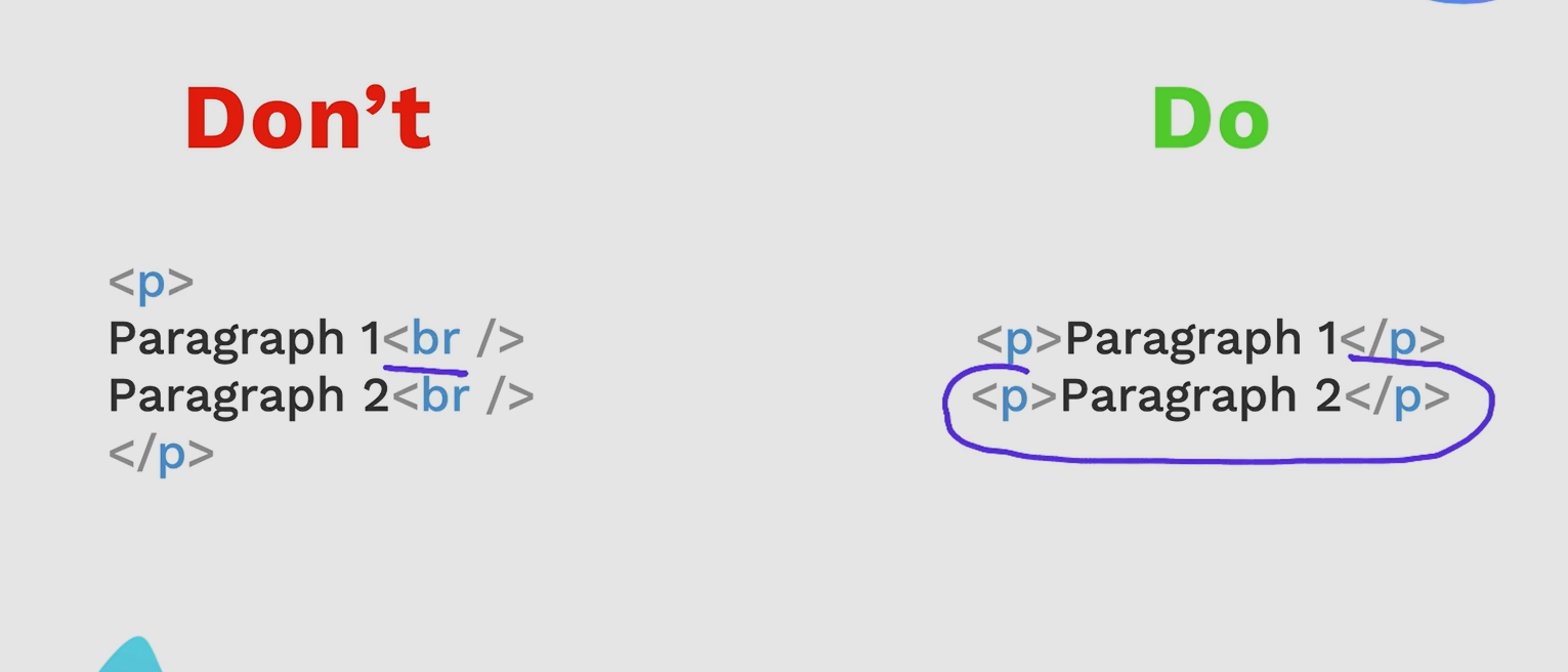
if its two different paragraphs, use < p/> instead of < br/>
1 | <hr /> or <hr> both works |
the List elements
unordered List
1 | <ul> |
it will create bullet points

ordered List

Nesting and Indentation

Notice: inside the list item, you embed another entire unordered list.
This is called nested list
indentation is important
Anchor Element
hyperlink


global attribute:


Image Elements (void elements)
1 | <img src = "url" alt = "alternative text description"/> |
File Path
absolute file path
relative file path
../ go up a level
./ current directory, the folder your file is directly located

Boilerplate(可供模仿的)样板文件,文件范例
- short cut:
type in ! And then hit enter, it will insert the boilerplate for you.
1 |
|
CSS
How to add CSS
inline: for specific section/ testing/ want it in one single element
internal: useful for applying it only to one HTML document
external: most used , styles.css
1. Inline CSS:
In this method, CSS rules are directly added to the HTML elements using the style attribute.
1
2
3
4
5
6
7
8
9
10
11
12
<html lang="en">
<head>
<meta charset="UTF-8">
<meta name="viewport" content="width=device-width, initial-scale=1.0">
<title>Inline CSS Example</title>
</head>
<body>
<h1 style="color: blue; text-align: center;">Hello, World!</h1>
<p style="font-size: 18px; font-family: Arial, sans-serif;">This is an example of inline CSS.</p>
</body>
</html>2. Internal CSS:
In this method, CSS rules are placed inside the
<style>element within the < head > section of the HTML document.1
2
3
4
5
6
7
8
9
10
11
12
13
14
15
16
17
18
19
20
21
22
<html lang="en">
<head>
<meta charset="UTF-8">
<meta name="viewport" content="width=device-width, initial-scale=1.0">
<title>Internal CSS Example</title>
<style>
h1 {
color: blue;
text-align: center;
}
p {
font-size: 18px;
font-family: Arial, sans-serif;
}
</style>
</head>
<body>
<h1>Hello, World!</h1>
<p>This is an example of internal CSS.</p>
</body>
</html>3. External CSS:
In this method, CSS rules are written in a separate
.cssfile and then linked to the HTML document using the < link > tag.styles.css:
1
2
3
4
5
6
7
8
9/* styles.css */
h1 {
color: blue;
text-align: center;
}
p {
font-size: 18px;
font-family: Arial, sans-serif;
}index.html:
1
2
3
4
5
6
7
8
9
10
11
12
13
<html lang="en">
<head>
<meta charset="UTF-8">
<meta name="viewport" content="width=device-width, initial-scale=1.0">
<title>External CSS Example</title>
<link rel="stylesheet" href="styles.css">
</head>
<body>
<h1>Hello, World!</h1>
<p>This is an example of external CSS.</p>
</body>
</html>
CSS Selector
!Type Selector: Selects all elements of a specified type.
1
2
3p {
color: blue;
}Class Selector: Selects all elements with a specified class attribute.
1
2
3.highlight {
background-color: yellow;
}ID Selector: Selects a single element with a specified id attribute.
1
2
3#header {
font-size: 24px;
}Descendant Selector: Selects all elements that are descendants of a specified element.
1
2
3div p {
font-weight: bold;
}Child Selector: Selects all elements that are direct children of a specified element.
1
2
3ul > li {
list-style-type: square;
}Adjacent Sibling Selector: Selects an element that is directly adjacent to another specified element.
1
2
3h2 + p {
margin-top: 20px;
}Attribute Selector: Selects elements with a specified attribute and value.
1
2
3input[type="text"] {
width: 200px;
}Pseudo-class Selector: Selects elements based on their state or position.
1
2
3a:hover {
color: red;
}Pseudo-element Selector: Selects a specified part of an element.
1
2
3p::first-line {
font-weight: bold;
}


CSS Properties
color
1 | p { |
font size
Pixels (px): This is an absolute unit of measurement. One pixel is equal to one dot on the screen. Using pixels for font size ensures consistent sizing across different devices, but it may not scale well on high-resolution displays.
1
2
3p {
font-size: 16px;
}Ems (em): The “em” unit is relative to the font size of the parent element. For example, if the parent element’s font size is 16px, then 1em is equal to 16px. Using ems for font size allows for more flexible and scalable typography.
1
2
3p {
font-size: 1.2em; /* 1.2 times the font size of the parent element */
}rem
relative to root size
1
2
3span {
font-size: 1.5rem; /* 1.5 times the font size of the root element */
}Percentages (%): Similar to ems, percentages are also relative units. When used for font size, percentages are relative to the font size of the parent element.
1
2
3p {
font-size: 120%; /* 120% of the font size of the parent element */
}Viewport Units (vw, vh, vmin, vmax): As mentioned earlier, viewport units are relative to the dimensions of the browser window. While primarily used for layout, viewport units can also be used for font size to create responsive typography.
1
2
3
4
5
6
7
8
9
10
11
12
13
14
15p {
font-size: 5vw; /* 5% of the viewport width */
}
div {
height: 50vh; /* 50% of the viewport height */
}
img {
width: 50vmin; /* 50% of the viewport minimum (width or height) */
}
div {
font-size: 3vmax; /* 3% of the viewport maximum (width or height) */
}
Font Weight
1 | p { |
In this CSS code:
font-weight: normal;sets the font weight of<p>elements to normal (equivalent to 400).font-weight: bold;sets the font weight of<h1>elements to bold (equivalent to 700).font-weight: lighter;sets the font weight of<h2>elements to lighter, adjusting relative to the parent’s font weight.font-weight: bolder;sets the font weight of<h3>elements to bolder, adjusting relative to the parent’s font weight.font-weight: 600;sets the font weight of<span>elements to a custom numeric value (600), which may vary depending on the font family.
Font Family
To use a font from Google Fonts, you need to follow these steps:
- Find the Font: Visit the Google Fonts website and browse or search for the font you want to use. Once you’ve found the desired font, click on it to open its page.
- Select Styles and Weights: On the font’s page, you can customize the styles and weights of the font. Choose the styles (regular, italic, bold, etc.) and weights (normal, bold, etc.) that you want to include in your project.
- Get the Link: After selecting the styles and weights, Google Fonts provides you with a code snippet to include in your HTML document. This snippet includes a
<link>tag that references a CSS file hosted by Google Fonts. - Add the Link to Your HTML: Copy the provided
<link>tag and paste it into the<head>section of your HTML document. This link imports the selected font styles and weights into your project. - Apply the Font: Once the font is imported, you can use it in your CSS styles by specifying the font family.
Here’s an example of how to use a font from Google Fonts:
1 | htmlCopy code<!DOCTYPE html> |
In this example, the font “Roboto” with weights 400 (regular) and 700 (bold) is imported from Google Fonts using the provided <link> tag. Then, the font is applied to the <body> element using CSS.
text align
1 | p { |
In this CSS code:
text-align: left;aligns the text of<p>elements to the left.text-align: right;aligns the text of<h1>elements to the right.text-align: center;aligns the text of<h2>elements to the center.text-align: justify;justifies the text of<h3>elements. Justified text aligns both the left and right edges of the text block. This means that each line of text is stretched to be the same width, with additional spacing inserted between words as needed.text-align: initial;sets the text alignment of<blockquote>elements to the initial value, which is typically left-aligned.text-align: inherit;inherits the text alignment of<span>elements from their parent element.
inspecting css
learn how to use chrome developer tools
Box Model
border:


padding
margin
https://www.w3schools.com/css/css_boxmodel.asp
CSS Cascading style sheets !!!
cascading rules

!!!!!!!!!!!!!!!!!!!!!!!!!!!!!!!!!!!!!!!!!!!!!!!!!!

css selectors
group selector
1 | selector1, selector2, selector3 { |
In this syntax:
selector1,selector2,selector3are individual selectors that you want to group together.property: value;represents the CSS properties and values you want to apply to all the grouped selectors.
child selector
1 | parent > child { |
In this syntax:
parentis the parent element you want to target.childis the direct child element you want to style. cant be grand child. it has to be only one level nested inside
For example, consider the following HTML structure:
1 | <div class="container"> |
If you want to style only the direct children (<ul> and <p>) of the .container div, you can use the child selector like this:
1 | .container > ul { |
In this example:
.container > ultargets<ul>elements that are direct children of elements with the class.container..container > ptargets<p>elements that are direct children of elements with the class.container.
descendant selector
can be grandchild and grandgrandgrandchild, it can be many many levels deep
1 | ancestor descendant { |
In this syntax:
ancestoris the ancestor element you want to target.descendantis the descendant element you want to style.
For example, consider the following HTML structure:
1 | <div class="ancestor"> |
If you want to style all <p> elements that are descendants of the .ancestor div, you can use the descendant selector like this:
1 | .ancestor p { |
chaining selector
1 | selector1selector2selector3 { |
In this case, the styles would only apply to elements that match all three selectors selector1, selector2, and selector3. There is no comma separating the selectors, indicating that they must all be true for the styles to apply.
here’s an example
1 |
|
In this example:
- The CSS selector
.container p.highlighttargets<p>elements with the class “highlight” that are descendants of elements with the class “container”. - Styles applied inside this rule set will only affect paragraphs (
<p>) that have both the class “highlight” and are descendants of elements with the class “container”.
css positioning
https://www.freecodecamp.org/news/css-position-property-explained/
https://appbrewery.github.io/css-positioning/
Static is the default
- static (default)
- relative
- absolute
When you apply absolute positioning to an element, it is positioned relative to its closest positioned ancestor. A positioned ancestor is an element that has a position property set to anything other than static (the default).
If all of an element’s ancestors do not have a specified position value (i.e., they all have the default value of position: static;), then the absolutely positioned element will be positioned relative to the initial containing block, which is usually the <html> element or the viewport itself.
- fixed
css Display
https://appbrewery.github.io/css-display/
- block:
Block-level elements typically start on a new line and occupy the full width available to them, pushing subsequent elements to new lines.
- inline:
you can’t set the size(width/height) of inline elements.
The width of an inline element is typically determined by its content. Unlike block-level elements, which take up the full width available to them and start on a new line, inline elements only take up as much width as necessary to contain their content.
However, you can still control the width of inline elements using CSS. While directly setting the width property won’t affect the layout of inline elements (because they’re inline by nature), you can use properties like max-width and min-width to indirectly control their width.

- inline-block
can have elements to go on the same line and you can set the width and heigth
- None
make the element disappear
CSS Float (not used often any more) don’t use float for layout
now it’s mostly just used to wrap the text around the img
https://www.w3schools.com/css/css_float.asp
The float property is used for positioning and formatting content e.g. let an image float left to the text in a container.
The float property can have one of the following values:
left- The element floats to the left of its containerright- The element floats to the right of its containernone- The element does not float (will be displayed just where it occurs in the text). This is defaultinherit- The element inherits the float value of its parent
In its simplest use, the float property can be used to wrap text around images.
The CSS clear property specifies what elements can float beside the cleared element and on which side.

Responsive web window
media query

1 | /* Default styles for all screen sizes */ |
Flexbox (display)
###flex
flex is a value for the display property.
when you use flex, it no longer abides by inline/block/inline-block/none
When you assign display: flex; to an element, it changes the default behavior of that element and its children.
By default:
<div>elements are block-level elements, meaning they typically start on a new line and take up the full width available.<span>elements are inline-level elements, meaning they don’t start on a new line and only take up as much width as necessary.
When you apply display: flex; to a parent element, it turns into a flex container, and its children become flex items. The flex container can then control the layout of its flex items using various flexbox properties.


flex direction
https://www.w3schools.com/cssref/css3_pr_flex-direction.php
flex basis has to go on to the child not on the container
In Flexbox, certain properties are applied to the flex container, while others are applied to the flex items. Here’s a breakdown:
Properties for the Flex Container:
- display: Specifies the container as a flex container. Use
display: flex;ordisplay: inline-flex;on the container element. - flex-direction: Defines the direction in which flex items are placed in the flex container. Options include
row,row-reverse,column, andcolumn-reverse. - flex-wrap: Determines whether flex items are forced onto a single line or can wrap onto multiple lines. Options include
nowrap,wrap, andwrap-reverse. - justify-content: Aligns flex items along the main axis of the flex container. Options include
flex-start,flex-end,center,space-between, andspace-around. - align-items: Aligns flex items along the cross axis of the flex container when they do not take up all the available space. Options include
flex-start,flex-end,center,stretch, andbaseline. - align-content: Aligns a flex container’s lines within the flex container when there’s extra space in the cross axis. Options are similar to
align-items.
Properties for the Flex Items:
- flex: Shorthand for
flex-grow,flex-shrink, andflex-basis. It specifies how a flex item will grow, shrink, and its initial size. - flex-grow: Specifies the ability for a flex item to grow if necessary. It accepts a unitless value that serves as a proportion. If all items have
flex-growset to 1, the remaining space in the container will be distributed equally among the items. - flex-shrink: Specifies the ability for a flex item to shrink if necessary.
- flex-basis: Specifies the initial main size of a flex item before additional space is distributed according to
flex-growandflex-shrink. - order: Specifies the order in which a flex item appears in the flex container. By default, all flex items have an order of 0, but this property allows you to change the order.
- align-self: Allows the default alignment set by
align-itemsto be overridden for individual flex items. It accepts the same values asalign-items.
flex direction
https://appbrewery.github.io/flex-layout/
align-self: flex-start
it makes this item separate from the group things to do its own thing
https://css-tricks.com/snippets/css/a-guide-to-flexbox/